An experience to remember
MADHU CHOWDHURY
2019, Bauhaus celebrates its centenary year: A movement that questioned creative principles across the world with its revolutionary style and approach, that argued and questioned everything that was thought of and accepted as art and aesthetics. Ideas about art, graphic design and typography continued to change, not only when impacted by major design schools such as Bauhaus or Basel School of Design.
The movement influenced a whole new generation of designers in various fields and institutes. The dedicated teachers let young minds breathe free of dictats held sacred till then. Together they experimented, argued and established themselves in whichever part of the world they went to, to explore new pastures and create a niche for themselves.
Typography – its meaning and application has evolved over centuries. Different practitioners have continued to interpret it for users and buyers to comprehend and understand. Sir Stanley Morrison famously said in 1935: ‘Typography may be defined as the craft of rightly disposing printing material in accordance with specific purpose; of so arranging the letters, distributing the space and controlling the type as to aid to the maximum the readers comprehension of the text… therefore any disposition of printing material which, whatever the intention, has the effect of conveying between author and reader is wrong.’
John Lewis, a designer much influenced by Bauhaus, Dadaism and Cubism, describes it well in his book Typography: Design and Practice, a book that remains unsurpassed in its ability to identify and describe these influences that have shaped the design of the printed page since the nineteenth century. Thinkers such as John Lewis influenced young writers, authors and designers.
One such person that this writer was fortunate to work with was Dilip Chowdhury. According to his peers, he had left a deep imprint of his style and bold daring statements in the London Times while studying at the London School of Printing and Graphic Arts. He arrived in Bombay for a brief stint, and worked with different advertising agencies. However, he was in search of new pastures in the editorial world as he felt advertising had a very short lifespan and little scope for self-expression in those years. He worked with Patwant Singh, who was then publishing The Indian Builder and Design magazine.
It was here that he was to interact with intellectuals, who were well established in the creative world of Bombay theatre and films. They were keen on publishing a magazine, but one that would be different from the usual kind that existed. He met Raj and Romesh Thapar, a charming wife and husband team in search of a designer to give shape to their ideas and help take it further with his intellectual and creative design talent.
It has been a remarkable journey of 60 years of survival of the trio’s interaction. Normally it takes two to give birth but in this case it took three individuals: Raj, Romesh and Dilip. Raj Thapar would often recount how when Asia magazine hired Dilip they had to send cover titles to him in Hong Kong as they had difficulty in finding an alternative. Raj also wrote, ‘Finding the relevant form to convey an idea to delve deeper into its intrinsic meaning, made him open doors to more and more exciting vistas. He was not frightened by space. He didn’t seek to crowd it with extraneous props or short cuts, but searched relentlessly for forms that gave value to the idea.’
S
eminar was to be a thought provoking magazine, delving into a given topic month after month, year after year, bringing together in a single issue diverse and often opposing views. Perhaps Dilip Chowdhury was the right person, brimming with new ideas and approaches. He lived design in every sense. This interaction of avant-garde luminaries saw the birth of what we all have come to respect, Seminar magazine. The magazine used box-board (then used for packing shoes) to print the cover page on the coarse side. The inside lent itself well for advertising as it was smoother and therefore had fewer problems of reproduction . Raj and Romesh were delighted as it was different and economical, in keeping with their philosophy and aesthetics.|
|
|
|
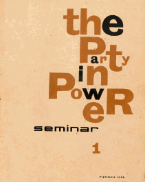
Cover of the first issue of Seminar, September 1959; designed by Dilip Chowdhury. |
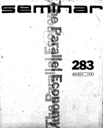
Cover design by Madhy Chowdhury, DCA. |
The limitations of this coarse boxboard paper dictated the use of a strong typographical rendering. It had its limitations though – one couldn’t use halftones and photographs, so it was simply types and types alone, said Raj in one of their meetings after Dilip passed away in 1982. It was Seminar that broke new ground not just with a typographic cover design, but with the inside editorial pages designed as well. This has given it a strong individual character, much talked about and exhibited in national and international fora. It was a unique concept. The trio together came to a workable solution for advertisements too, which were bunched at the beginning and end of the issue. Raj Thapar had smiled and narrated to me how Dilip had told her that, ‘advertisers like to dictate positioning of their ads!’
Dilip emphasized the importance of simplicity of form and colour; multicolour design was not necessarily the key to success, he would often argue. A designer with imagination will never consider restrictions on the use of colour as a handicap. Another important aspect in designing for Seminar was to avoid halftones as far as possible. Dilip would often emphasize this aspect as the printing quality as well as the availability of fonts and the composing by hand, lino or mono, was extremely limited.
R
aj Thapar, ‘Dilip believed that a designer was a catalyst in heightening people’s consciousness, in giving them eyes to see with whether it be the coffee cup, the morning newspaper or billboards on the street – life was one complete whole.’ Dilip had designed them all. His Hindustan Times masthead and design, or his work on the weekend newspaper, are all remembered. To understand the difference between the creative excellence of Dilip Chowdhury and the work of his contemporaries, it is necessary to know something about the influences which shaped him. Dilip was a product of Santiniketan before moving to London to study design. His zest for changing the graphic landscape of India intensified his efforts to set new design standards. His work of this period is at the same time bolder, yet more refined; his use of space less inhibited, his involvement with type increasingly evident.As editor-publisher of Design magazine, Patwant Singh wrote, ‘...if asked about the single most important element which shaped Dilip Chowdhury into a designer of unusual caliber, my answer would be that since perception is in itself an act of creation, his perception of things around him played a major part in the development of his talent. Had he been two dimensional, insensitive to the countless things around him, which can excite the imagination, he would not have risen above the ordinary. His wide range of interests including architecture, product design, clothes, books, music, dogs was a key element in the originality of his approach in his work. This helped him reach a position of pre-eminence in the field of graphic design.’
W
hile remembering Dilip, Raj Thapar once laughed and narrated how he would say with a smile, ‘How would you like to see a face with a big nose and nothing else?’ – stressing the need for young designers to be aware of activities in allied fields and cultural activities. Life is one complete whole and cannot be divided into separate bits and pieces. This is what set him apart from the intensely competitive world in which he lived. It was also this aspect that infected the young and old designers and artists who worked with him. He urged them to relate the physical and mental environments, in all its aspects, only then would they be able to find the appropriate form and solution.It was after his restless search and travels, and his interaction with writers, photographers and designers the world over, that he formed his own studio in 1967, simply calling it Dilip Chowdhury Associates and settled in Delhi. Raj Thapar wrote, ‘…associates was more appropriate than what he could have originally thought, because in the mid-1968 he married a young designer, Madhu, and together they worked on the varied problems of communication ranging from editorial design, exhibition design, promotional material for corporate companies, trademarks, books, newspapers, and film titles, to prove that graphic design can be inspiring socially.’
Winning national awards or judging them, the studio was on its way to recognition. In 1978, DCA was selected as National Correspondent for the First Asian Biennale to be held in Tehran where our works were exhibited and printed in a catalogue. Thus began international representations at BRNO in 1982 as part of ICOGRADA (International Council of Graphic Designers Association). ‘It was all too short as Dilip passed away in 1982 leaving the mantle on his young wife to run his office. He had shaken the world of Indian graphic design out of its complacency; he had shown the way of survival without compromising. It was this reputation that I had to maintain in a tough world that was questioning who the designer was at Dilip Chowdhury Associates. I still remember how Mr Thapar sent a hand drawn doodle with instructions to complete the art work following the doodle – a tough call on a young widow who had yet to return to work.
N
ext month it was the same, if I recollect correctly. The title that came from the Seminar office was ‘The Parallel Economy’, this was already testing an impatient ‘associate’ as she was restless and couldn’t sleep. The associate took the toughest call of her life then – to run DCA on the same terms, or shut it down. She sat up in her studio at home and plunged into the brief, as a designer does, and sent her design to the Seminar office with cold feet and a sense of nervousness. The phone rang and both Raj and Romesh said how much they liked the cover design and did not want me to do an artwork but to print it as sent. When the visual came back, the team was thrilled to read ‘excellent’ written on the visual with a flourish in Romesh’s Montblanc pen.Writing in a typography magazine, Sujit Patwardhan wrote, ‘It is hard to believe that many of these covers [of Seminar] were done more than 30 years ago and printed by letterpress with blocks and typeset in hot metal. For their striving for perfection and attention to detail, these designs stand out as rare examples of outstanding typographic design. Today when design has become a high profile profession and designers, particularly in the agencies acquiring near celebrity status, looking at the pioneering work by Dilip Chowdhury Associates is indeed a humbling experience.’
F
rom then on we didn’t’ look back. One often heard comments in the studio whenever scholars, journalists or film makers arrived, that when seeing the visual or art work being done for Seminar covers, the response was, ‘magazines may come and magazines may go but Seminar will go on forever.’ This confidence gave the studio motivation and courage to test itself repeatedly in participating in ICOGRADA shows, but also to test new waters. Works were printed in World Trademarks and Logotypes in both volumes from Japan. Madhu was to win an award for a poster design from Finland in 1987.Before concluding, there is one nostalgic memory to add. When working on a title, I needed to use a good calligraphy pen, but had used an ordinary nib. As usual, Mr Thapar quietly got up after lunch, walked to his table and came back with a calligraphy nib Montblanc pen for me, which I still keep. I miss them for their generosity and advice. They had become mentors, friends, and benefactors for us till their passing away. It is not surprising that their successors have furthered their legacy.
* Dilip Chowdhury 1959-1968, Dilip Chowdhury Associates 1968-1982, and 1982-2000.